My first entry in my Benchmark Project comparing the Grosse Pointe Public School System with Ann Arbor, Birmingham, Bloomfield, Farmington, Northville, Novi, Plymouth-Canton, Rochester, and Troy.
After a publishing hiatus, I’ve been thinking about the serious challenges that lie ahead for Michigan public schools and the GPPSS in particular. Using new data sources, data joining techniques, and visualization tools I think we can enhance our views for the difficult task ahead.
This introductory presentation covers data we’ve examined before on this site. I will add a wider set of municipal, tax, and data from other Michigan public schools in ensuing posts. I am aiming for one per week.
If you have questions or suggestions as we rev up again, feel free to pass them along. I will try to keep my editorial to a minimum and emphasize facts and objective analysis so that together we can solve some problems.
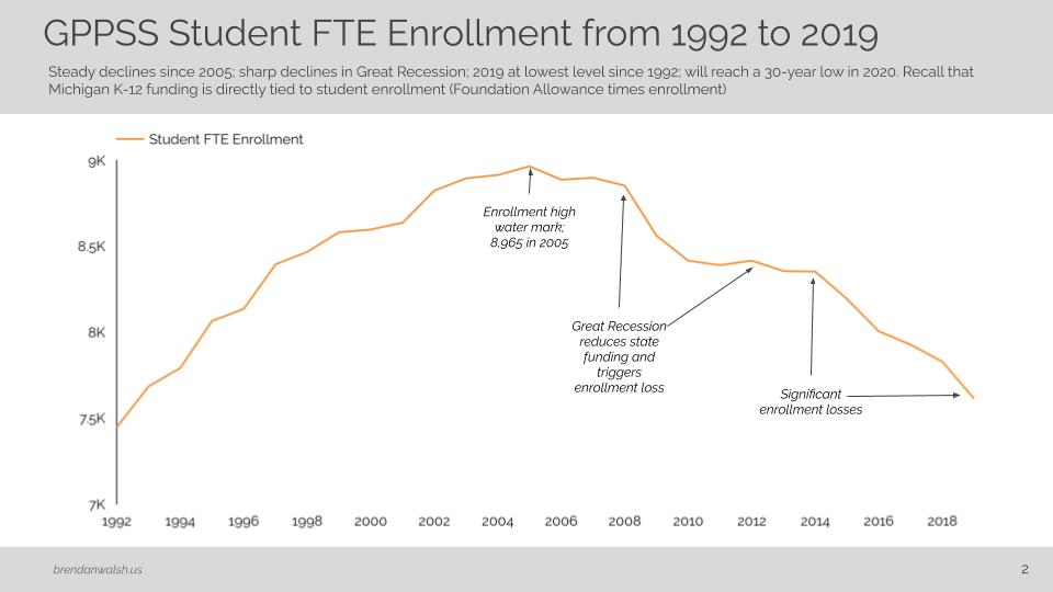
GPPSS Enrollment Trend
- Steady decline since the 2005 high water mark of 8,695 student in 2005.
- Large reduction in the last two years take enrollment to levels not seen in nearly 30 years.
- Recall that in Michigan, funding follows the student and district revenues rise and fall with it.
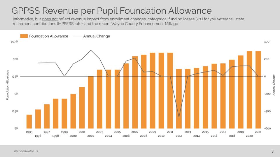
Per Pupil Funding Trend from 1992 to 2021
- Some recovery of decreases from The Great Recession, but increases since 2008 mostly consumed by retirement cost increases.
- Recall that the recent Wayne County Enhancement millage is incremental to the per pupil Foundation Allowance.
- Future analysis will focus on how GPPSS’ per pupil funding has tracked with other comparable Michigan districts.
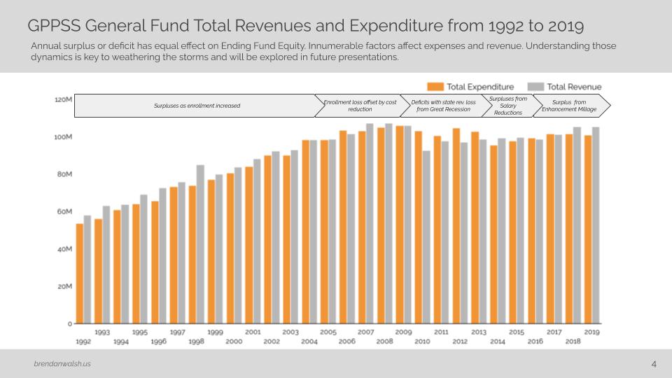
GPPSS General Fund Revenues and Expenditures
- Chart reveals years in which the district ran a surplus (grey higher than orange) or deficit (orange higher than grey), which is what increases or decreases Fund Equity (examined on slide 4).
- Revenues increased steadily from 1992 to 2005 as enrollment increased.
- Traditional and significant cost reduction from 2006 to 2013 responded to declining enrollment and reduced state aid.
- Salary expense reductions enabled recovery of equity lost in Great Recession.
- Higher revenue in 2018-19 result from Wayne County Enhancement Millage.
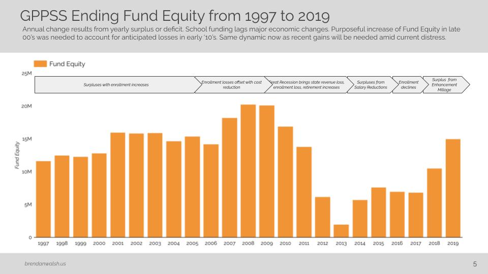
Fund Equity Trend
- Exploded view of impact of annual surplus or deficit. Orange bars go up with surplus and down with deficit. Same dynamics as slide 3.
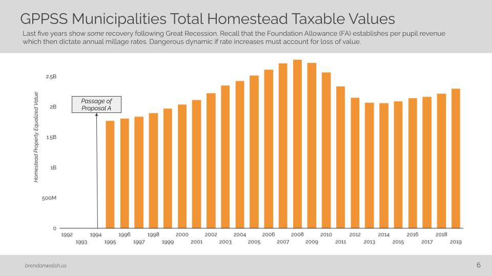
Homestead Property Taxable Values
- We’ll try to bring more analysis to the relationship between the GPPSS and municipally managed Taxable Values. In general we can see that values fell sharply in The Great Recession with moderate increases over the last few years.
- Recall that per pupil funding does not change with taxable value change, but rather the millage rates adjust in accordance with the change. Lower values result in higher millage rates.
I look forward to providing future analysis.
2 responses to “Benchmark Project: Readying for the Storm”
I don’t find power points or videos user friendly. I prefer print form narratives. Can this stuff be adapted as an article with graphs and talbes, when appropriate?
Hi Tija and Happy New Year,
Thanks for the feedback. I go back and forth about the best way to address what you’re asking. I’ll probably go back and add some narrative to the article (or do a new one). The issue is when I work with so many graphs, cutting and pasting each into blog articles is really time consuming. Each graph has tyo be saved as a picture and transferred to the web site, etc. In the past I have done this but it takes a lot of time. Let me think on it and see if can find the right balance. Take care.