My fourth entry in my Benchmark Project comparing the Grosse Pointe Public School System with Ann Arbor, Birmingham, Bloomfield, Farmington, Northville, Novi, Plymouth-Canton, Rochester, and Troy.
Property taxes and education have a bit of a forced marriage – and all the ugliness that can come with it.
While property values are easily measured, educational values are harder to quantify. We can agree that school quality affects property values and property taxes fund a significant portion of our schools. So let’s take a look at property value trends.
For this installment of my series, I tracked the Homestead Property State Equalized Value (SEV) of the ten benchmark districts over the course of Proposal A era (1995 to present). Let’s start with a broad view and then we’ll narrow in. Below is the cumulative Homestead SEV for all the ten benchmark districts.
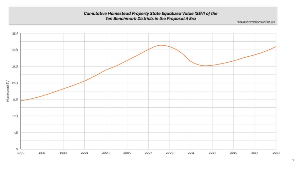
For these districts, aggregate Homestead SEV doubled during the Proposal A era (from ~$15 billion to $31 billion) with a hard detour brought on by the 2009 market crash. It’s taken ten years to return property values to reach pre-crash levels.
That one tidy line above has ten different stories within it. Take a look at the different stories across all the benchmark districts.
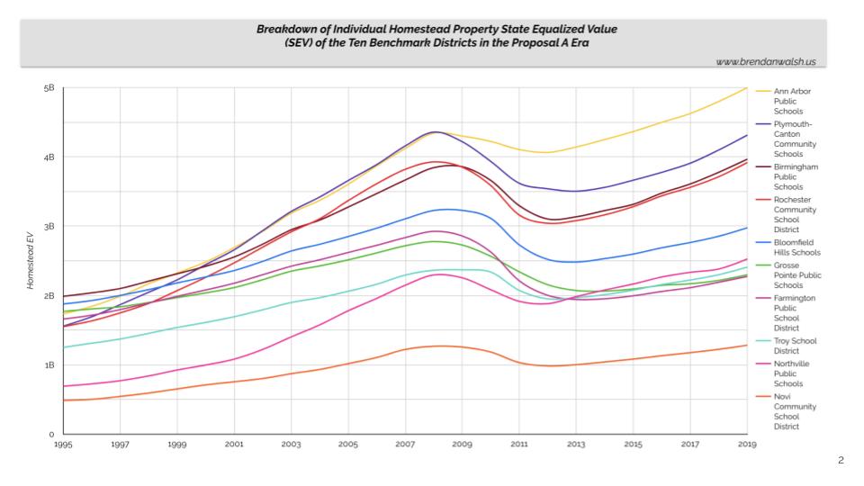
See the steady, but varying growth among the ten districts leading up to the crash (1995 to 2008) and varying rates of loss resulting from the crash (2009 to 2012). As an example, Ann Arbor’s Homestead SEV declined -2.8% in 2011 while Farmington’s plummeted -16% in the same period.
This is more easily seen in the next chart, illustrating the variance in growth and contraction rates throughout the Proposal A era.
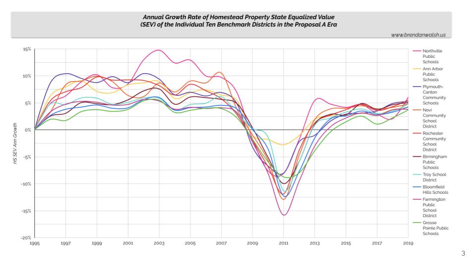
The recovery period (2012 to 2014) highlights the variance. By 2013, six of the districts returned to growth while the other four were still declining. But we can observe an overall, long-term muting effect on growth after the crash (2014 to 2019).
No doubt that high-quality public education is almost always a factor in a community’s economic prosperity, but there are so many other factors. Ann Arbor’s surrounding economy undoubtedly helped buttress it against the crash’s impact. Other districts don’t have such powerful tools at their disposal.
Let’s try to boil all this down into one chart showing the total growth of each district’s Homestead State Equalized Value for the 25 year period from 1995 to 2019.
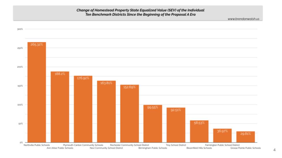
If you live in the communities more on the left of this chart, you are probably paying more taxes, but you have enjoyed substantial increases in home value – two sides of the same coin. The growth is not due exclusively to the school system, but it’d be hard to blame them. Moving to the right of the chart, we have some different stories that raise their own questions.
Putting on my Grosse Pointer hat, those questions are serious – and they get more serious when we overlay tax rates which we’ll examine shortly.